Biography Layout: Audrey Hepburn
Photo via https://korous.files.wordpress.com/2013/03/52.jpg
|
Magazines and publishing companies implement various techniques when designing and printing a page of both textual information and photography. To mimic and practice these techniques, I chose a noteworthy individual, Audrey Hepburn, and used Adobe InDesign to create a magazine spread about her life.
|
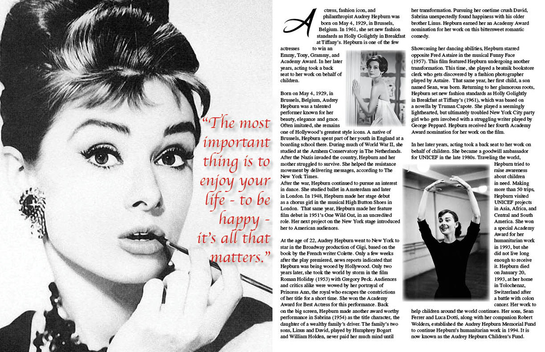
To begin my project, I first had to choose a noteworthy individual. For this, I chose Audrey Hepburn, as she was not only a renowned actress and fashion icon, but also a philanthropist who dedicated much of her life, and funds, to helping those in need. Though she is deceased now, there are many charities continuing on in her name, out of respect for the time and work she put into aid in third world countries. Next, I found three, clear, good-quality pictures of her from various sources on the internet. I then researched for a developed article about her to be used as the textual information; in this case I referenced biography.com. I also found a good, influential quote by her, in this case choosing, "The most important thing is to enjoy your life - to be happy- it's all that matters." In InDesign, I created a two page, facing pages, letter-sized document, and used the place tool to drop my three photos into the unused white spaces. Next, I created a text box, and copied the quote into it, and then created a separate text box to place within the borders of the second page. Here, I copy and pasted the text about her life, and edited the settings so that it would appear in two columns. I also unchecked the "hyphenation" box, in the paragraph window, to ensure that none of my text would be cut off with hyphens as it reached the border cut-offs of the columns. Creating a small, separate text box, I chose a display font, and typed the first letter of the very first word of the textual information, in this case, the script letter "A." I then deleted the "A" from within the text, and moved the new text box up into the top left corner, in its place. With this letter selected, I created outlines, and then opened the Text Wrap window. I implemented the "Wrap around object shape" wrap, which then allowed for the article text to shape around the letter. In a similar fashion, I moved my two pictures into the body of the text, altering and varying their sizes. With each picture selected, and in the Text Wrap window, I chose the "Wrap around bounding box" wrap. This allowed the body text to also move around the pictures which I had placed within. In the Text Wrap window I could further edit the space between the three objects and the text which surrounded them. I could then edit the text so that the complete article would fit into the space, as well as give the text a regular, serif font. Next, I moved my final picture to the first page, and sized it to fit the entire space. Finally, I moved the quote onto this page, gave it a color that would pop and a display-style font, and arranged it to fit in the clear space next to her face. To this, I implemented several effects, such as inner and outer glow, to make it more visible. I concluded by enacting a general "feathering" effect on the pictures within the the text.
